Q169. Consider the 12 block neighborhood bounded by parks on the north and south and major thoroughfares on the east and west. Green houses are supporting Obama, purple houses Romney.

Using the facing blocks delineated by the red dashed lines as units (it yields 15 of them), calculate the index of dissimilarity.
Q168. Suppose we have a diffusion process in which susceptibles who are in contact with an infected in a given time period have a 50% chance of becoming infected in the next time period. Now play the “game” again except this time flip a coin each time (or use a random number chart for probabilities other than 50:50) to see whether neighbors become infected or not. Note: You might not want to play all the way out to time period 5! On the grids below color in squares to indicate what happens over the first six time periods beginning with one infected. Then fill in the table and chart the data.


Q171. A common phrase to describe processes in which people engage in imitative behavior is "bandwagon effect." Explain the appropriateness of this metaphor.
Q164. Sketch a flowchart that represents the logic of setting up a Schelling "tipping model":
To Create Schelling Model
- Set up the model.
- Run the model until everyone is content to stay where they are.
To Set Up
- Start with an NxN grid.
- Identify a number of type A residents and a number of type B residents such that A+B is less than N2.
- Randomly place As and Bs on grid.
To Run the Model
- For each resident, evaluate move/stay choices
- For each resident, find new location for all those that choose move.
To Evaluate choice
- Identify the resident
- Count all neighbors
- Count similars
- Compute ratio
- If larger than threshold, mark as stay, otherwise mark as move
To Move
- Select a random square
- If empty, move there. Otherwise try again.
Q170. Suppose you have a population of one hundred persons. It is divided into five categories of willingness to join a protest all of which depend on people's expectations of how many others will appear at the protest. The thresholds range from very low (I'll go if anyone else is going) to the very high (I won't go unless basically everybody else is going).
Assume the population is divided among these categories as follows:
| Challenge of Recruiting | Very Easy | Easy | Average | Hard | Very Hard |
|---|---|---|---|---|---|
| Participation Threshold | 1 | 10 | 40 | 60 | 99 |
| Number at this threshold | 10 | 20 | 40 | 20 | 10 |
a. If news reports suggest that 15 people will show up, how many actually will?
b. If last week saw participation of 41 and this is widely reported so that everyone knows, how many will come out this week? And then next week? And after that?
c. What if 91 came last week?
|
|
Last problem was 0480 (HELP) |
Q164. Sketch a flowchart that represents the logic of setting up a Schelling "tipping model":
To Create Schelling Model
- Set up the model.
- Run the model until everyone is content to stay where they are.
To Set Up
- Start with an NxN grid.
- Identify a number of type A residents and a number of type B residents such that A+B is less than N2.
- Randomly place As and Bs on grid.
To Run the Model
- For each resident, evaluate move/stay choices
- For each resident, find new location for all those that choose move.
To Evaluate choice
- Identify the resident
- Count all neighbors
- Count similars
- Compute ratio
- If larger than threshold, mark as stay, otherwise mark as move
To Move
- Select a random square
- If empty, move there. Otherwise try again.
Q167. Suppose we have a diffusion process in which all susceptibles who are in contact with an infected in a given time period become infected in the next time period. On the grids below color in squares to indicate what happens over the first six time periods beginning with one infected. Then fill in the table and chart the data.


Q172. Consider this data on the thresholds in a population. Draw a frequency histogram and cumulative frequency diagram. If news reports suggest participation will be at 20 people, how many people's threshold is met or exceeded? How about if the number is 70?

Q173. Consider this data on the thresholds in a population. Draw a frequency histogram and cumulative frequency diagram. If news reports suggest participation will be at 20 people, how many people's threshold is met or exceeded? How about if the number is 70?

Q174. Consider this data on the thresholds in a population. Draw a frequency histogram and cumulative frequency diagram. How does this system behave when the expected number is 10? 20? 50? 60? 90?

Q175. Consider this data on the thresholds in a population. Draw a frequency histogram and cumulative frequency diagram. Plot the cumulative distribution on a chart with a 45 degree line.

Q176. Which of the cumulative frequency distributions below corresponds to this frequency distribution

A.  |
B.  |
C.  |
D.  |
E.  |
Q177. Which of the cumulative frequency distributions below corresponds to this frequency distribution

A.  |
B.  |
C.  |
D.  |
E.  |
Q178. Which of the cumulative frequency distributions below corresponds to this frequency distribution

A.  |
B.  |
C.  |
D.  |
E.  |
Q179. Which of the cumulative frequency distributions below corresponds to this frequency distribution

A.  |
B.  |
C.  |
D.  |
E.  |
Q180. Which of the cumulative frequency distributions below corresponds to this frequency distribution

A.  |
B.  |
C.  |
D.  |
E.  |
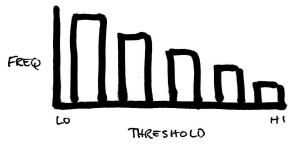
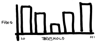
Q181. Which threshold frequency distribution corresponds to the following description:
This population is divided between those who are very easily persuaded to participate - they will jump on bandwagon readily - and people who are very reticent to join a movement, with relatively few people in between.
A.  |
B.  |
C.  |
D.  |
E.  |
Q182. Which threshold frequency distribution corresponds to the following description:
The community has a few people who will join no matter what, a few more who will join if some others have joined, still more who will join if a goodly number are on board and so on all the way up to a hesitant few but even they will join if it appears everyone else has.
A.  |
B.  |
C.  |
D.  |
E.  |
Q189. Our campaign wants to hold a giant rally the Sunday before the election. Many voters are fired up, many are tired. Some think we can win, others not so sure. Suppose the ready-to-jump-on-the-bandwagon threshold distribution is shown below. The numbers here mean how many people are willing to come to the rally given different levels of expected participation.
Analyze this information and describe the direction our organizing strategy should go. What should we expect? How much intervention could produce how much of a desired result. Assume that our current research suggests about 40 people are currently planning on going to next week's event.
| Threshold | Count |
|---|---|
| 0 | 12 |
| 10 | 3 |
| 20 | 4 |
| 30 | 5 |
| 40 | 6 |
| 50 | 9 |
| 60 | 13 |
| 70 | 17 |
| 80 | 19 |
| 90 | 6 |
| 100 | 0 |
Q326. (A) Consider this plot of Pn+1 vs. Pn. Without worrying about what sort of system it might be, show that you understand how the chart works by describing the behavior of this system if it starts at time i at Pi=30. How about 70?
(B) If this is a model of attendance at, say, a protest rally with the axes representing percentage of the population, and Pn is how many showed up last week (a number everyone knows) and Pn+1 is how many that means we can expect this week (based on the distribution of individual thresholds - how many people need to be going for me to decide to go), how would you interpret the gaps A and B on the chart?
(C) Think about the "standing ovation model." What features does it add to the basic model described here.


